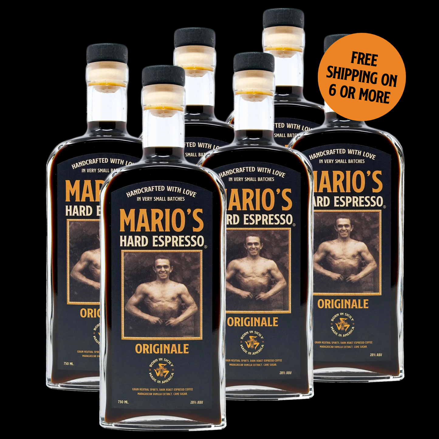
Our Amor Et Agave limited edition bottle is now available at Henebery's online.
Amor Et Agave was born from a shared intention: to celebrate life, memory, and community through the union of two cultures that, though oceans apart, share the same heartbeat. This collaboration between Mario’s Hard Espresso and Real Del Valle Tequila honors the legacies of both — a Sicilian craftsman whose passion brought people together, and a Mexican tradition rooted in family, reverence, and celebration.
At its core lies the same purpose that inspired Mario himself: to bring people together, to share stories, laughter, and love. The quail of RDV, a symbol of gathering and community, mirrors Mario’s spirit — his belief that life is best savored among friends and family. Together, they form a narrative of connection that transcends geography, language, and time.
Created in honor of Día de Los Muertos, this limited edition is a reflection of deep respect — for heritage, memory, and the universal human need to honor those who came before us. To acknowledge our shared roots, the label’s inscriptions are written in Latin, the linguistic ancestor of both Italian and Spanish, representing not one culture or the other, but the common origin from which both traditions arise.
Every aspect of Amor Et Agave was crafted with intention: from the intricate label illustrated by Italian artist Antonietta, to the use of handcrafted Mexican blown glass, chosen for its warmth, character, and authenticity. The bottle itself, like the art it carries, is a reflection of human touch — each piece unique, imperfect, and alive with the spirit of the maker.

The result is an ultra-premium creation — complex and extraordinary in both taste and meaning — that embodies the very essence of Mario’s legacy: love, craftsmanship, and the beauty of shared humanity.
In the following interview, Antonietta shares the story behind the art — a look inside the soul of the label that brings Amor Et Agave to life.
Bridging Worlds: The Art of the Día de Los Muertos Label by Antonietta
At Mario’s Hard Espresso, every bottle tells a story — but our limited-edition Día de Los Muertos collaboration with Italian artist Antonietta takes storytelling to another level.
Her intricate illustration captures both the soul of this Mexican celebration and the deep roots of Sicilian artistry, bridging two cultures through emotion, memory, and craftsmanship.
An Artist Shaped by Curiosity and Contrast
“It may sound like a cliché,” Antonietta begins, “but I’ve always felt connected to art.”
Growing up in Southern Italy near the Amalfi Coast, she describes her earliest creations — “building imaginary houses with Lego or drawing small landscapes immersed in nature” — as unconscious beginnings of a lifelong dialogue between space and feeling.
Her style, she says, is born from “the need to visually translate what I feel inside… to make the invisible visible.” Influenced by Caravaggio and Piranesi, Antonietta seeks “strong contrasts, playing with light and shadow to emphasize depth and drama.”
What makes her work deeply human is her embrace of imperfection: “Every ‘imperfect’ stroke becomes an authentic and necessary mark, humanizing the work and bringing it closer to the observer.”

A Connection Beyond Borders
When asked about her reaction to the project, Antonietta admits, “I immediately felt the weight of fear. It was an important and complex project… yet that fear turned into a driving force.”
She describes a moment of profound emotion upon learning that the label would honor Mario, the man whose legacy inspired the brand:
“The honor of telling something so intimate, of celebrating the soul and memory of Mario, made me feel alive and deeply involved. Every line I drew had to speak of respect, memory, family, friendship, and life.”
Though she didn’t grow up with Día de Los Muertos traditions, Antonietta connected deeply with its spirit. After losing her mother in 2018, she found the project deeply personal:
“I drew that label as a tribute to those I have loved and lost, putting every emotion, attention and care into each detail. Designing this label meant giving shape to remembrance, transforming absence into visibility, creating a space where their spirit could manifest.”
She saw parallels between Mexican and Italian traditions — both rooted in reverence for family, memory, and celebration of life.
“The intention was to create a bridge between two cultural sensitivities, letting emotion and respect guide every line, every stroke of the illustration.”

The Making of a Living Label
Antonietta immersed herself in both cultures before ever touching pen to paper.
“I started by studying Mexican symbols, colors, and the meaning of the celebration. Then I turned to my Italy — Sicilian instruments, traditional clothing, architecture, mausoleums. From this fusion came the first sketches.”
Each element carries symbolic weight:
- Black acts “as a curtain, a backdrop highlighting the dynamism of the label.”
- Orange recalls marigold flowers — “a symbol of life and memory.”
- Dancing skeletons and Catrinas celebrate “the joy of existing.”
- Cherubs, drawn tenderly embracing skulls, “accompany the souls into eternal life.”
“Every detail has a precise meaning, designed to tell a story. The label is not only to be looked at — it’s to be felt.”
Her favorite hidden touch? “My initials, A and P, are there… but where? That is a little mystery for you to discover,” she laughs.

A Tribute in Ink and Emotion
When she saw the label on the bottle for the first time, Antonietta was overwhelmed:
“My main goal was not to make it commercial, but to give it a soul, a presence capable of living on the glass of the bottle. I sincerely hope I succeeded.”
For her, the collaboration represents something much deeper than design:
“I was not only the illustrator but also a witness to Mario’s memory and legacy. Feeling the trust they placed in my hand and sensitivity was a profound and unforgettable privilege.”
She hopes that each bottle inspires a pause — a moment of reflection.
“I wish it to become a moment of contemplation, an invitation to remember what they taught us and to perceive their presence through our daily actions. I would love it to be an occasion for a small sip in their memory.”
Looking back, Antonietta says,
“I am proud to have given shape to something that is not only a label, but a sincere and authentic tribute. Every line, shadow, and small element was designed to do justice to Mario’s memory and the story of his family.”
A Label That Lives On
The result is more than artwork — it’s a conversation between cultures, a dialogue between the living and the remembered.
Through Antonietta’s hand, the Día de Los Muertos label becomes a celebration of heritage, craftsmanship, and love that endures beyond time.
“Emotional, intense, deep.”
That’s how she describes it — and we couldn’t agree more.